Templates and resources
The inspection report cover page, five jobs in one screen
What belongs on an inspection report cover, what each element does for the reader, and the restraint that separates professional covers from cluttered ones.
By Owen Murray, founder of InspectorKit · Updated July 6, 2026
The cover is the most-seen page of the most-kept document your business produces. It appears in every forward, every screenshot, every years-later rediscovery, and it gets more total reader-seconds than any finding you will ever write. That audience deserves design attention, and the design turns out to be a short list of jobs done cleanly rather than anything decorative.
Five jobs, one screen.
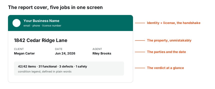
Job one, establish who stands behind the report
The top of the cover belongs to identity, business name, logo or wordmark, contact details, and the license number, composed as a single band. Every downstream reader, the client's parents, the opposing agent, the contractor, the buyer of the house two owners later, needs the provenance question answered instantly, who did this and are they legitimate.
The identity band is also the branding argument at its highest-traffic location. Whoever's name occupies that band collects the professionalism of everything below it, which is why it must be your business and not your software vendor, and why the branding setup is a first-week task rather than a someday one.
Job two, name the property unmistakably
The address is the headline, large, complete, unmissable, because the property is what every reader came about, and because reports get filed, forwarded, and confused. An agent juggling four transactions, a relocation office processing dozens, a client who inspected two houses in one week, all of them sort documents by the address, and the cover that makes them hunt for it has failed its simplest job.
Job three, list the parties and the date
Client, inspection date, agent, report status, in a clean strip. The date carries more weight than it looks, an inspection documents a day, every limitation statement leans on that fact, and the date's prominence on the cover is the first brick of that boundary. The parties strip settles who commissioned the work, which matters when the report circulates past its original audience, and the status line, published, tells every reader they are holding the real document rather than a draft.
Job four, give the verdict at a glance
The modern cover's best addition, the stats block, items inspected, counts by severity, with the condition legend defining the terms in plain words. Five seconds of reading delivers the shape of the house, forty-two items looked at, thirty-one fine, three that need repair, one safety item, and the reader enters the report calibrated instead of anxious.
This block is what separates a cover that is merely branded from one that works. It respects the true reading pattern, most readers want the verdict first and the details second, and it feeds the summary-first structure that the rest of the document runs on. The counts also do quiet credibility work, the of-42 phrasing says nothing was skipped, which is transparency no adjective can buy.
Job five, restraint
The fifth job is refusing everything else. No marketing copy, no service menus, no badge walls, no inspirational tagline, no three fonts. The cover of a professional document reads like the title page of something serious, because it is one, and every decorative addition dilutes the four working jobs above.
Restraint extends to color and composition, one brand color doing structural work, generous space, type that would survive a black-and-white print. The sample report's cover is a working demonstration, a colored identity band, the address as headline, the strip, the stats, and nothing else asking for attention.
Print and dark-mode survival
Two rendering environments quietly test every cover decision. The printed version, because some reader always prints it, should survive grayscale, which means the identity band's contrast has to come from tone and type rather than color alone, and the stats block's severity dots need their labels doing the work. And the phone-at-night version, where most first opens actually happen, rewards the same restraint, one strong band, large address type, and nothing delicate enough to disappear on a dim screen. Neither test requires extra design effort, both just reward the simple cover over the clever one, which is the recurring theme of this entire page.
The forwarding test
One evaluation exercise covers everything above. Screenshot your current cover and imagine it arriving cold, forwarded by your client to their skeptical father, a person who has never heard of you and distrusts the transaction on principle. Does the screenshot answer who did this, with what license, on what property, on what date, and how bad is it, before he has scrolled once. If any answer is missing, that element needs promoting. If anything in the frame is not helping answer those questions, it is decoration and a candidate for removal. The forwarded-to-a-skeptic read is the cover's real job description, because the cover is the page that travels furthest from your control, and it should carry everything it needs to represent you alone.
The template does it forever
The practical footnote that makes all of this cheap, the cover is a template artifact, not a per-report task. Set the branding once, and every report assembles its own cover from the inspection's details, the address, the parties, the date, the live counts. The design decisions above get made exactly once, which means the cover is the rare piece of report quality that costs zero marginal effort, and the version of it that represents you well is the same price as the version that does not. Choose accordingly, once, and let a few hundred reports carry it.
Common questions
Should the cover include a photo of the house?
It is a matter of taste, and if used it should be the establishing shot, straight on, good light, the whole structure. What the property photo must never do is displace the working elements, identity, parties, date, and the at-a-glance verdict, which earn their space by being what readers actually need.
Does the license number really belong on the cover?
Prominently. It answers the credibility question before it forms, it is required or expected in many states, and it costs nothing. The reports that get forwarded to skeptical relatives and opposing agents benefit most, since the license line settles who-is-this before it gets asked.
What about disclaimers on the cover?
Keep them off it. Scope and limitations language belongs in its own section where it can be complete, not compressed into cover fine print. A cover that leads with legal hedging reads defensive, and the boundary language reads better arriving after the reader has seen the work.